
-
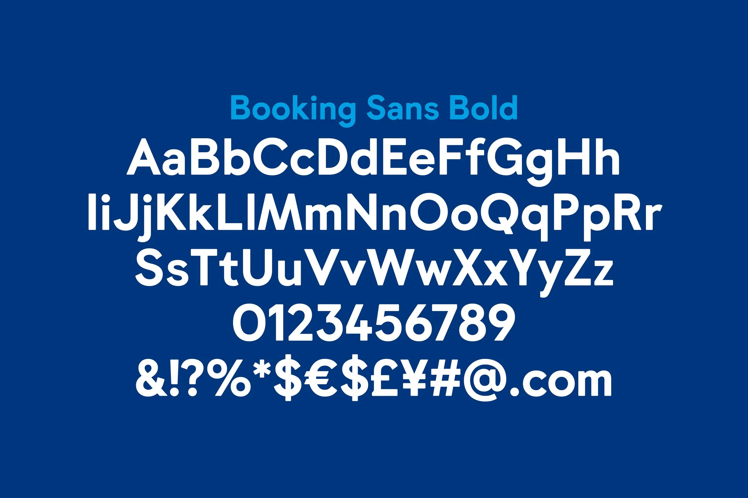
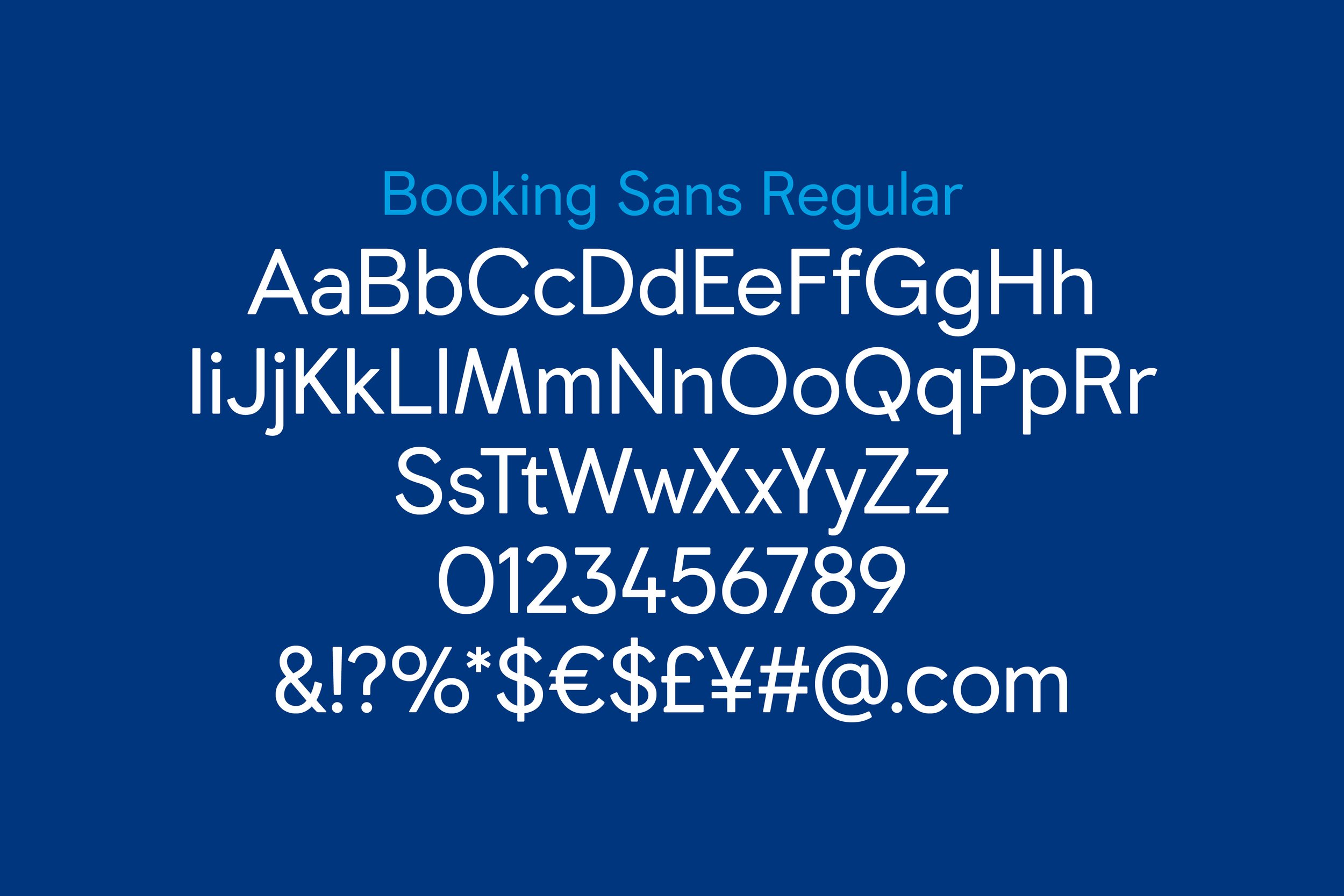
The typeface created for Booking.com ultimately borrows its rationale from the very planet it encourages its users to explore — acknowledging its perpetual tilt toward the glow of the sun: precisely 23.4371°. Using this measure as an organizing principal for the construction of the type. We begun with a Bold display weight for use with a specific forthcoming campaign, and subsequently developed a the Regular / Text weight for a more general usage.


Previous
Previous
Amazon Music — Have You Heard?
Next
Next